The Challenge
Build a new interactive kiosk experience for retail stores that carry STIHL products
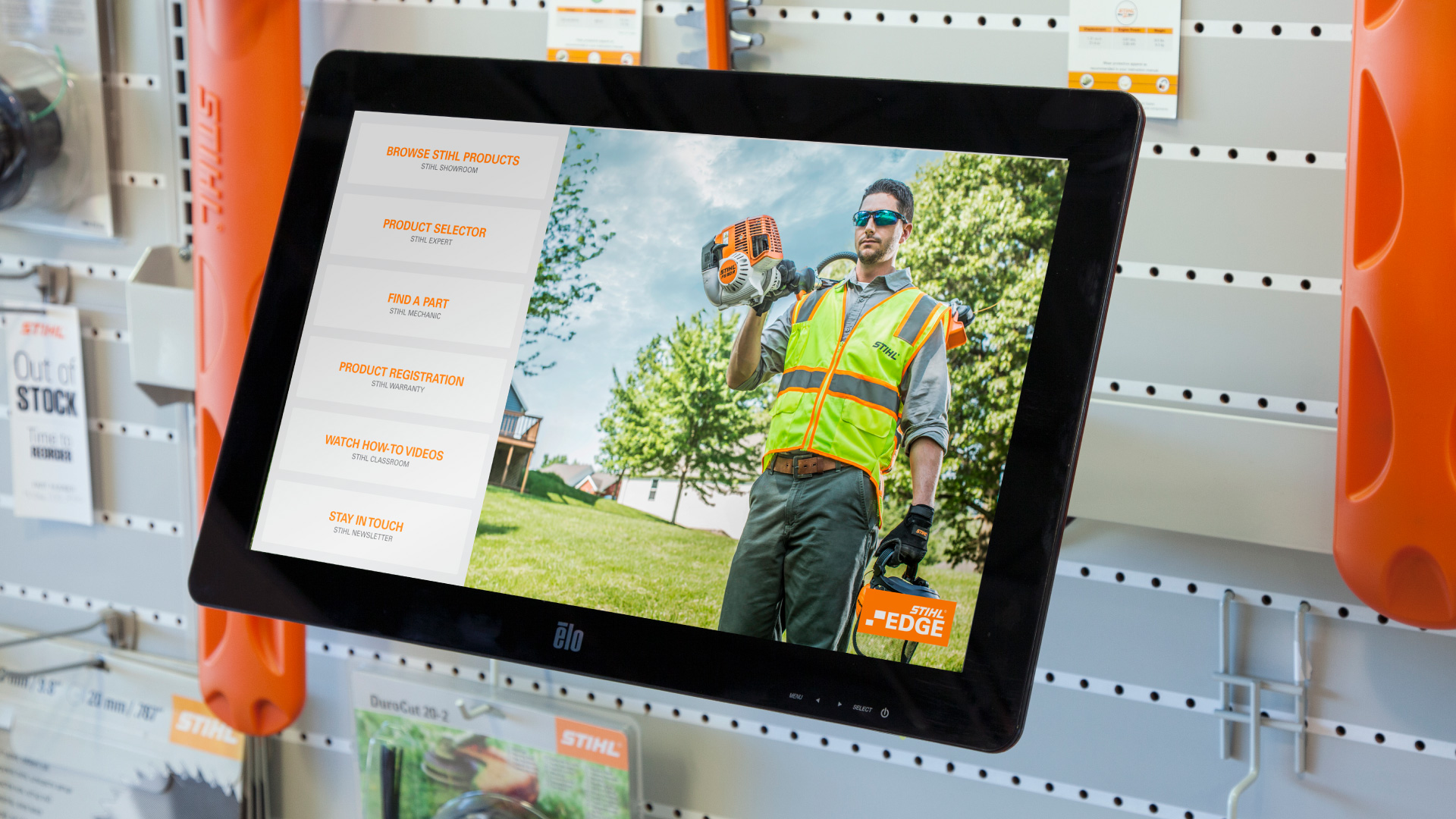
We had already made a STIHL app for the John Deere touchscreen, which had great success. STIHL saw the opportunity and had us make their own touchscreen. I was part of the naming process and created the logo. Our goal was to build a browsing experience of all the STIHL equipment they sold. This touchscreen is in places like ACE Hardware. They have their own aisle in a lot of stores. They wanted a touchscreen right in the middle of their products so that the customers could easily research more on the equipment they are about to buy.
My Role
I led the design from start to finish, worked as a team on user experience research, and led the information architecture. Presented updates of user flows, wireframes, visuals, and provided thoughts on how to best move forward.
In addition, I worked with the creative director, project manager, software developers, sales team, CEO, and the CTO directly.
I built custom HTML and CSS/SCSS page templates for the engineers to hook directly up to the backend. The build process on my end was using a custom Gulp.js file to convert SCSS into one minified CSS file.
The Business Requirements
Setting the requirements
The list of requirements came from a combination of our CEO talking to STIHL corporate and also an internal ideation phase that then got approved by STIHL.
The ideation phase included whiteboard sketches of possible applications, conversations about what could be useful to a customer, asking why they would be using the apps, and doing user stories based on assumptions from John Deere customers. This helped with setting what users to interview and create a product backlog so the engineers could start working on the initial codebase.
Here is a list of the requirements we landed on:
- Expand from being an app on the John Deere touchscreen into their own hardware setup with their own set of apps.
- Add their online product selector to the touchscreen, because they wanted it more interactive.STIHL Product Selector
- Include a full suite of products with the ability to easily scale in the near future. Note: As we were building this, they were actively building out the STIHL Lightning battery product line.
- Have the ability to lookup parts and part numbers so the customer could buy a new one. This was one of our suggestions, because we had success with the John Deere's Filter Paks™ lookup.
- A better way to register products.
- STIHL wanted a way to have educational videos put onto the touchscreen.
- A way to capture emails for marketing and lead generation.
The Discovery
Research
Dealers and Retail Stores
The dealers and stores are using it to sell more STIHL products while helping educate their customers. They use it for product registrations and capturing emails aswell.
Customers
Customers are using the touchscreen to research about a certain STIHL product. They are able to watch how-to videos and use the product selector to help them choose the right piece of equipment.
Corporate
Corporate wanted to use the touchscreen to help market new and improved products and help educate customers in the buying process.
User Personas
After interviewing experts, store owners, and corporate, we had a good understanding of who the customer was. Plus the users that shopped at John Deere dealerships were the same exact customer who bought STIHL products. We were then able to generate a few user personas and tell a story of why they would use certain features on the touchscreen.
User Journeys
We were able to build journeys based on conversations at interviews and developed personas. We would walk the persona through an experience and try to see what would be going on in their minds. One example was to have a persona go through searching for a chainsaw to compare.
The Information Architecture
Organizing the content
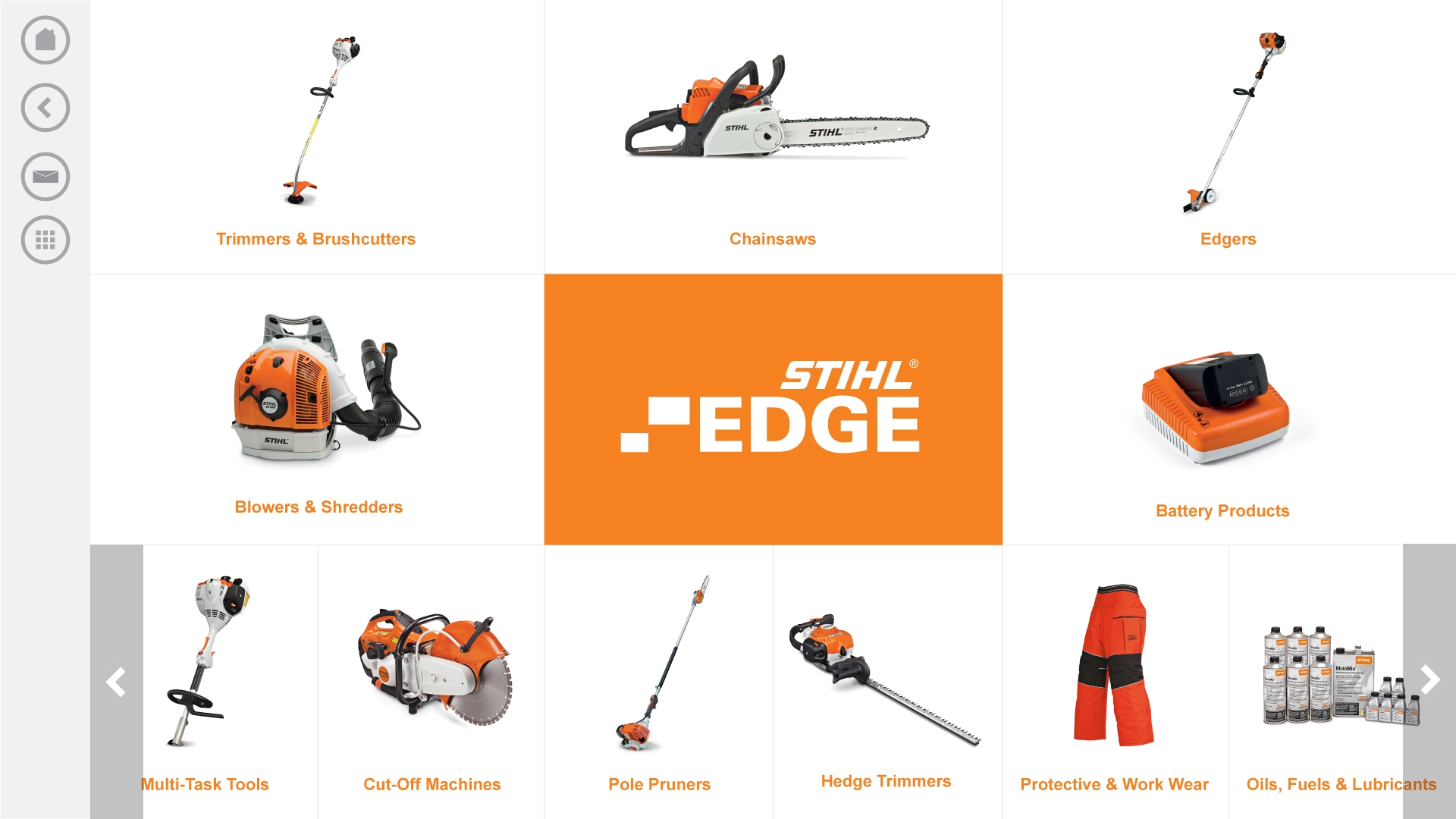
I was in charge of laying out the entire application and organizing the applications. Once we had the apps we were going to build, I was easily able to seperate them into their experiences on the touchscreen. The browsing products architecture came from the STIHL's website. We kept the categories very similar to what they had already built. If I were to do it from scratch, I would have used a card sorting method to help build the initial sitemap.
The rest of the applications were pretty easy to figure out a structure to build on. When I had the sitemap and wireframes done, I would review it with the creative director, lead engineer, CEO, and CTO.
Sitemap

The Applications
Product Catalog
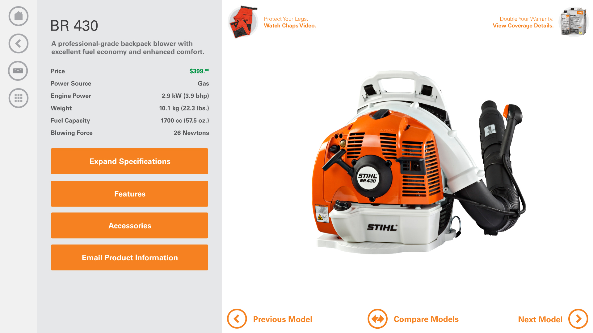
The product catalog had almost the entire STIHL product line. Every piece of equipment had it's own landing page with it's own specifications, features list, and accessories. These pages included everything about the product and allowed you to compare with another similar product. These pages had safety videos and callouts for promotions.
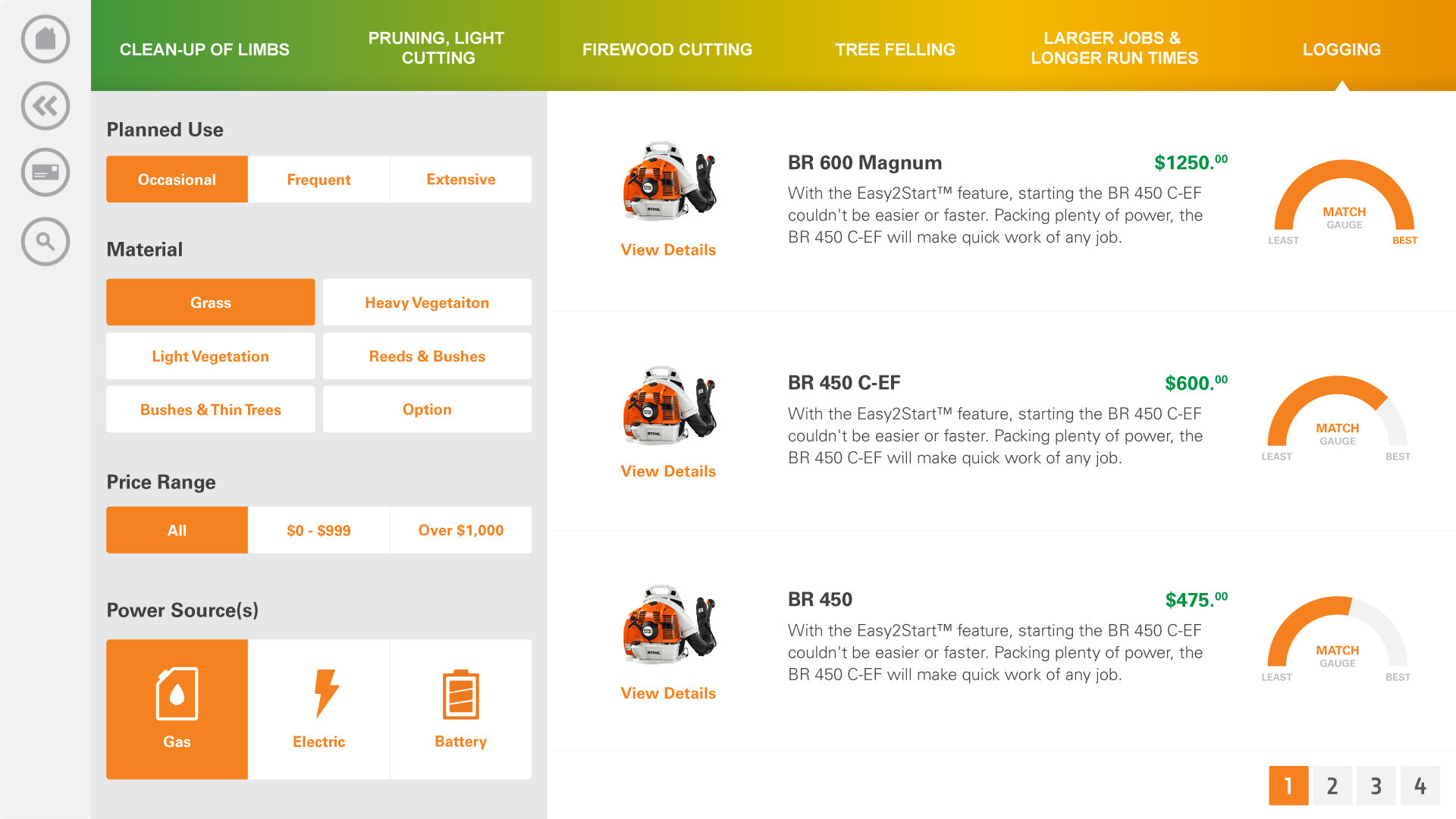
Product Selector
The product selector was a guided path of questions to help narrow down the piece of equipment that fits your job the best.
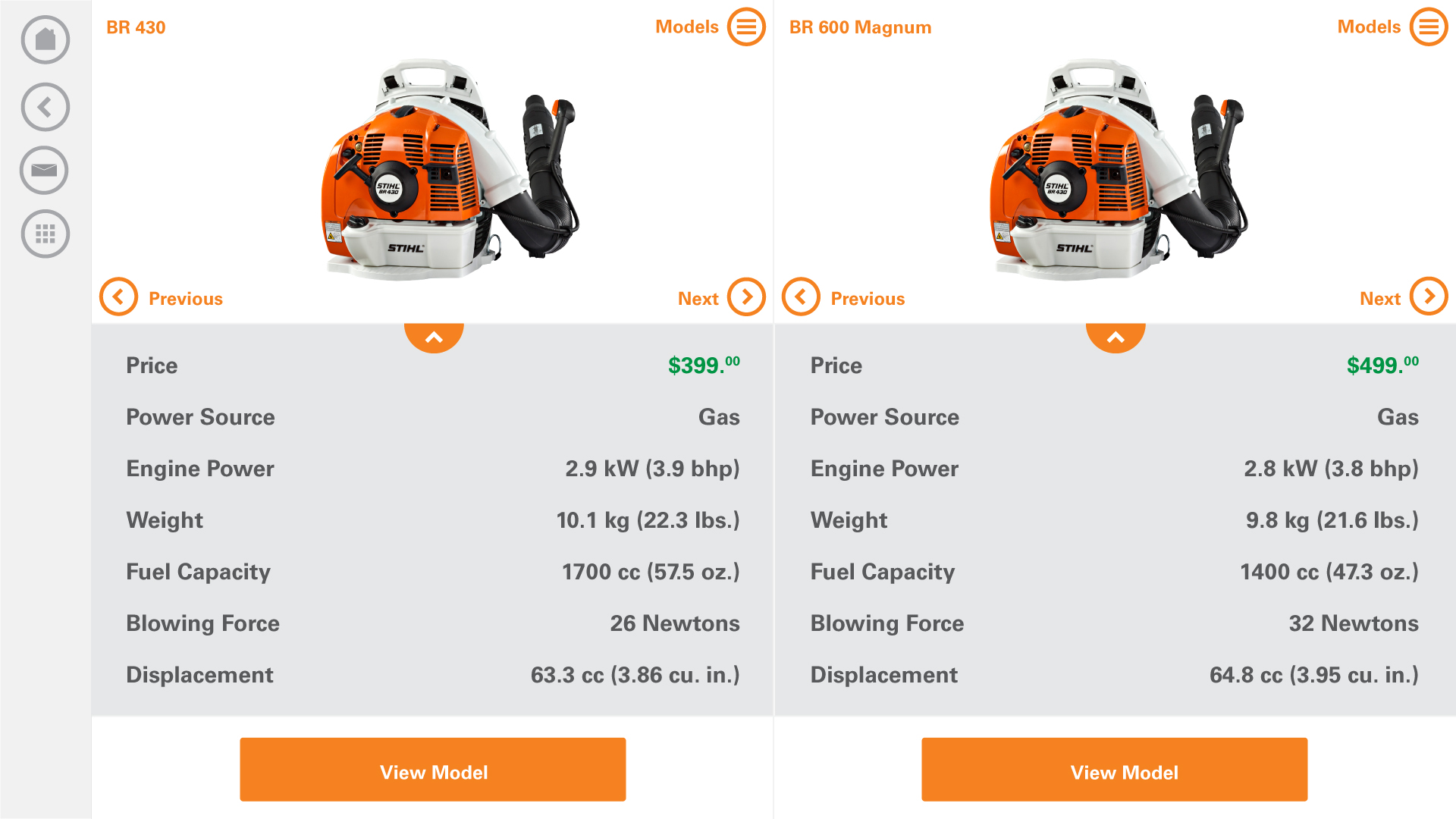
Product Comparison
Once you get to the product landing page, you would then be able to compare it with another product. This set up a screen with the products sitting side-by-side. This helped quickly compare products. You could then change either side as you please.
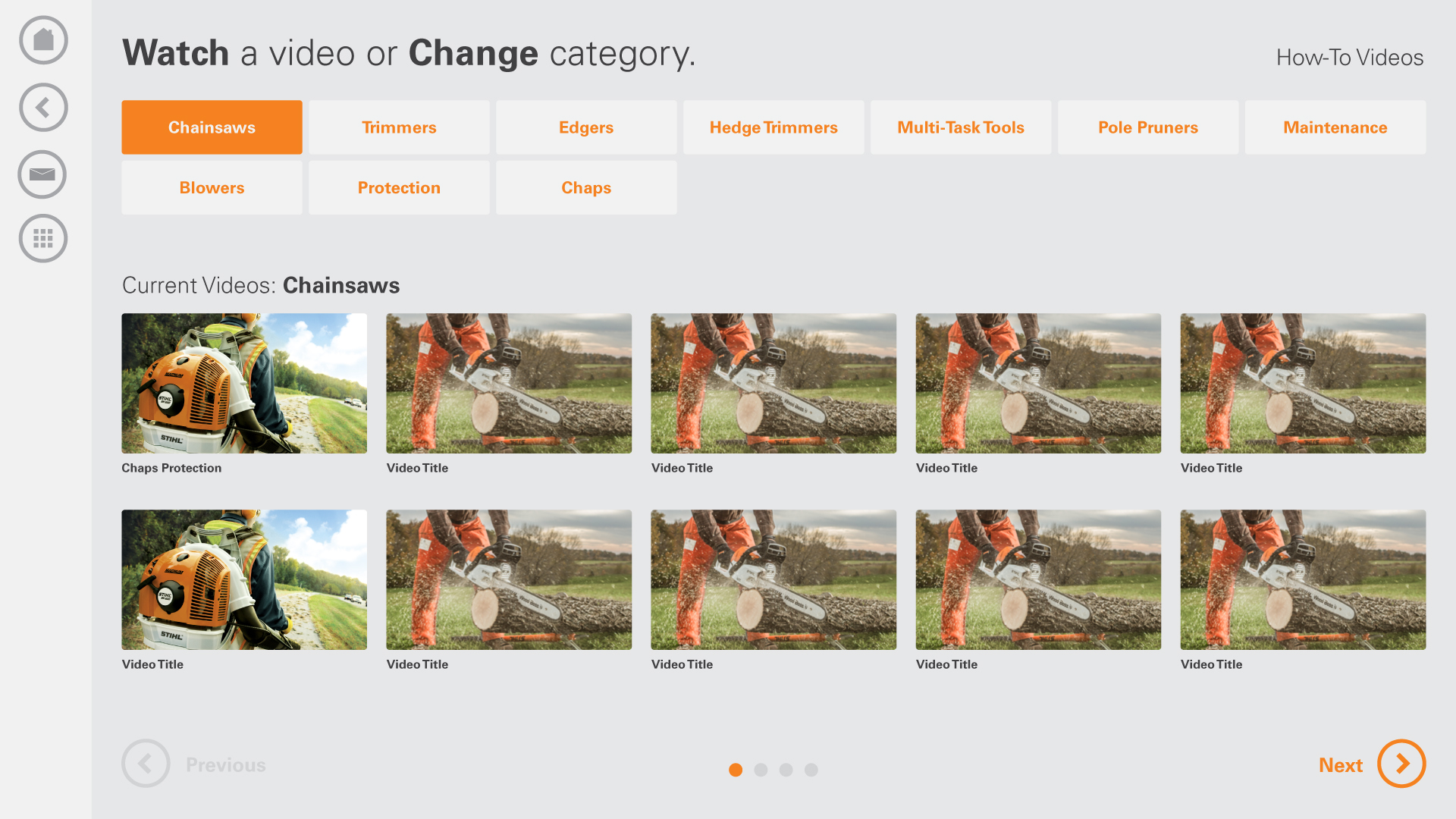
How-to Videos
This was a simple app that had a list of product videos to watch. Watching these videos after a purchase was a great tool for the stores. They could get up to speed on their new piece of equipment while the employee would get their product ready. For example, a chainsaw needs to get set up and started before it goes out the doors.
Product Registration
After you purchase a product, you can then register it on the touchscreen. That registration then gets sent to STIHL overnight and it's instantly registered. We helped save a lot of time here, because before the stores would have them fill out paperwork. The paperwork would then take 4-6 weeks to fully register in the system.
Find a Part
STIHL had a very nice database with all the information to pull down with our API. With that being said, we could easily put together an app that looked up any part to find a number. All you had to do was input a model number and then a list of parts would come up for that product.
Dealer Newsletters
Basic newsltters and email capture is pretty standard practice for a retail store. We set up an app to do exactly that. This helped dealers that weren't too savvy to start getting in their first emails. We woud educate them on what they could now do with those emails.
The Design Thinking
Keeping it clean
My overall approach to this project was to keep it clean and modern feeling. We had complete creative freedom except for the color scheme. The color scheme needed to stay with the branding, standard branding protocol.
The initial effort was to put together a moodboard with a variety of UI designs that I thought would lead to inspiration. From there I would start having ideas of what the overall look would feel like. Then I would start executing the designs in Illustrator. When I got to a certain comfort level on the design I would be able to start making an initial front-end design pass.
As I was designing, I always thinking about how I would code the design.
We had originally had the main navigaiton on the bottom, but we put more effort into researching the left side placement. In the John Deere touchscreen, we received feeedback that the bottom navigation bar was a little hidden. Users sometimes didn't see it right away. Since time on one of these touchscreens is extremely precious, we had to go back and rework the placement. We felt that the new placement worked better, because it is clearly visible on the side and it stays their on every screen.
I tried to use a more light color based approach to let the colors on the products shine through. With this approach, I am able to do more with contrasting colors with the brand orange.
The Deliverables
Engineering assets
I provided coded front-end page templates, components, and a design spec to the engineering team. This included HTML and SCSS files with a custom Gulp file for minifying and converting the SCSS to CSS.
The BETA
Testing Users
Once we got a BETA version ready, we would release a special software version to dealerships to run tests. Our testing consisted of sending the dealers questions and tasks to run through. After they did that, we would interview them about the test and get feedback.
Unfortunately, We didn't have the budget to be in-person to observe them and the touchscreens don't have screen recording software.
We did have an internal reporting tool that would show information about every user session. This helped us validate user flows and journeys.
The Launch
Bringing Awareness
We had a big sales team and communication with all the territory managers and the U.S. STIHL project manager. We worked out a plan that included demos, email campaigns, and conferences. We also had help from the territory managers. They would be doing their own awareness to their dealerships that they were in control of. Some territories would have 250+ dealerships to communicate with.
The Impact
3,000+ Stores
This project ended up being huge success with 3,000 stores signing up within the first two months. The potential was to be in around 9,000 stores world-wide. The territory managers were really impressed with the overall experience and could wait to get them installed at their locations.
We helped change the way STIHL does product registration too. When a customer buys a chainsaw, they register the product right there in the store on the touchscreen. Now the dealer has almost no paperwork to fill out and send into corporate. Also while they are waiting, they can educate themselves on the prdouct they just bought by viewing the how-to videos.